The Curiosity Gap: How Blurring AI Results Fixed My SaaS Conversions
A lesson in UX psychology and why your plain "Upgrade" button is killing your Indie Hacker project.
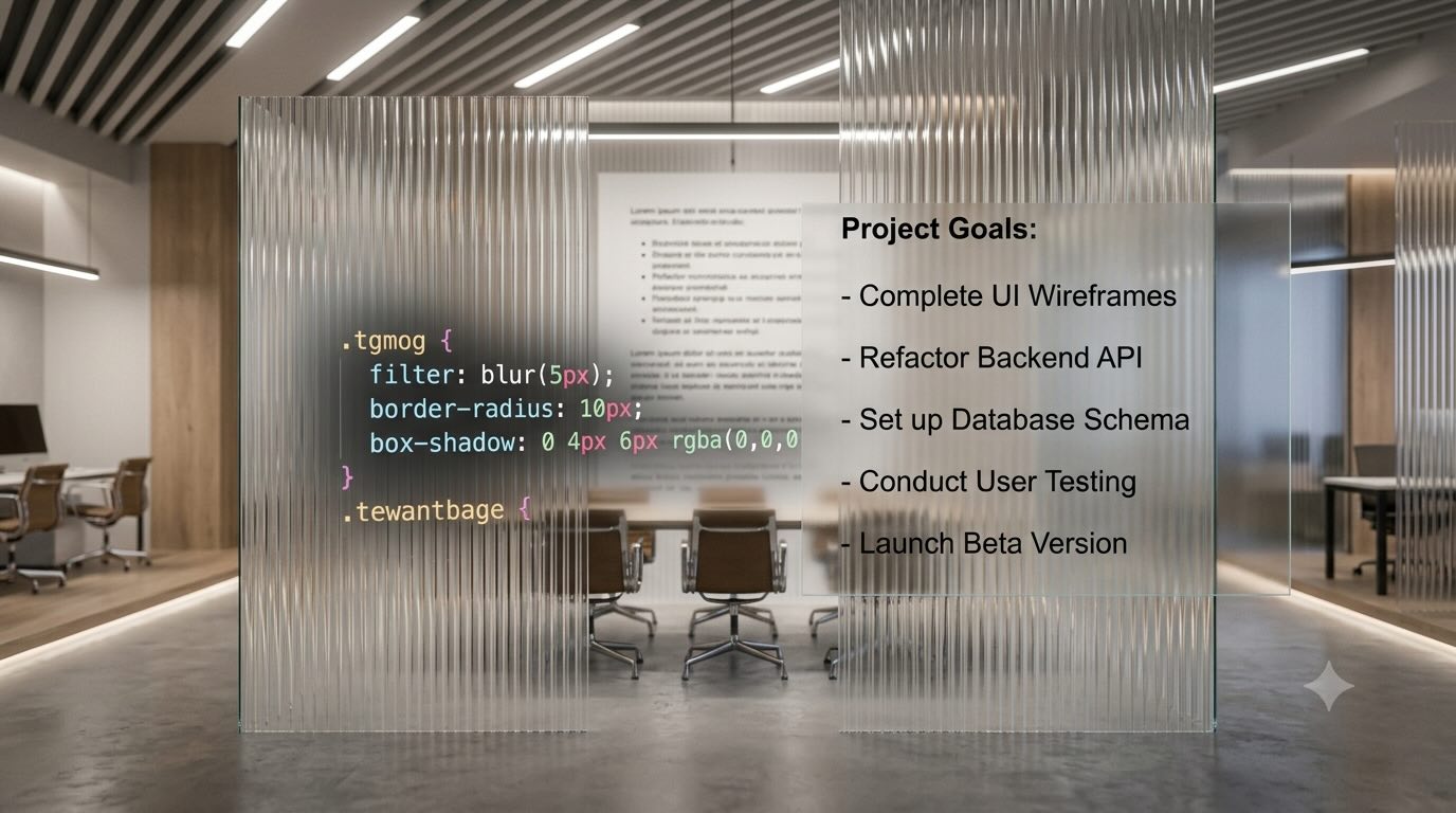
As technical creators, our instinct is to build more features when our product isn't selling. If users aren't converting, we assume the AI isn't smart enough yet. We swap models, tweak prompts, and bloat our codebase.
I fell into this exact trap with my side project, FreeAudioToText.
The premise of the app is simple: it transcribes long audio files with high precision and privacy. To monetize, I added a premium feature that uses LLMs to generate structured meeting summaries and speaker insights.
 For 90 days post-launch, my conversion rate for this premium feature was a flat 0%.
I analyzed my analytics. Users were transcribing their audio, downloading the raw text, and ignoring the premium upgrade entirely. The problem wasn't the AI quality; the problem was my user experience. I was asking them to pay for a promise (an "Upgrade" button) rather than a tangible result.
The CSS Blur Experiment
Instead of building a new feature, I engineered a roadblock. I wanted to trigger FOMO (Fear Of Missing Out) and leverage the "Curiosity Gap"—the cognitive itch that occurs when we know there is information we don't possess but can almost touch.
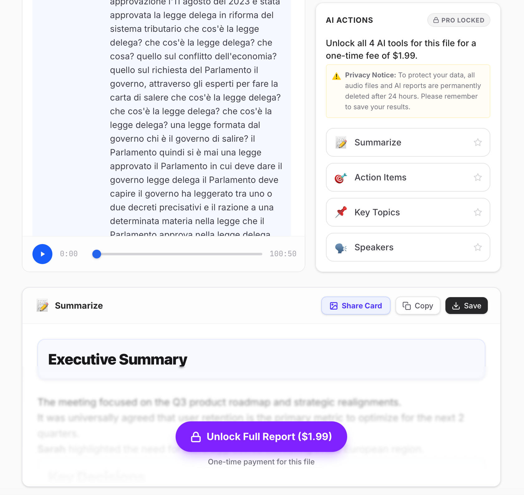
I changed the flow: I let the backend generate the AI summary, pushed it to the frontend, but obfuscated the text container.
I didn't just replace the text with a lock icon; I used a CSS blur. There is something deeply psychological about a blur. It implies the data is right there underneath, just out of focus. You can see the neat bullet points and the paragraph breaks. It feels much closer to your grasp.
The UI now communicated: "Here is the perfect summary of your chaotic 2-hour meeting... but you can't read it."
The Results
The impact was immediate. The very next day, the zero-sales curse broke. Users who previously would have taken the raw text and left were now converting simply to satisfy their curiosity about those blurred rows of insights.
The takeaway for developers is profound: building a sustainable product isn't just about the technology stack. It's about designing a user journey that strategically guides behavior. Don't be afraid to gate your best value visually—if it's truly valuable, people will gladly pay to clear the blur.